Working with pixel loop
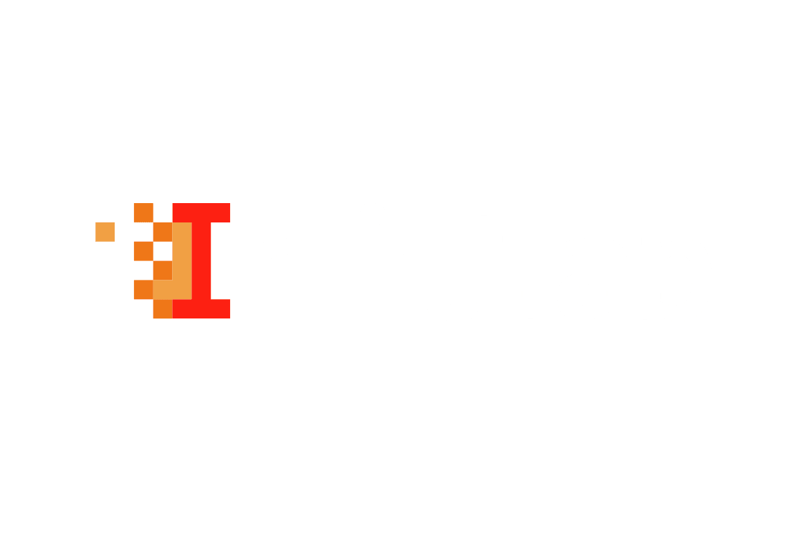
In the original logo, the main graphic element was the pixel loop. It looked somewhat "noisy". It was this element that was to become the unifying element in the company's brand line of services; it needed to be simplified and structured.

Putting together a concept
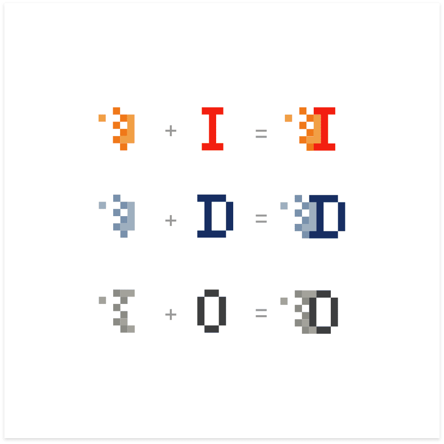
Main graphic element - pixel loop + first letter of sub-brand = the basis of the graphic language of the corporate identity.

3 directions
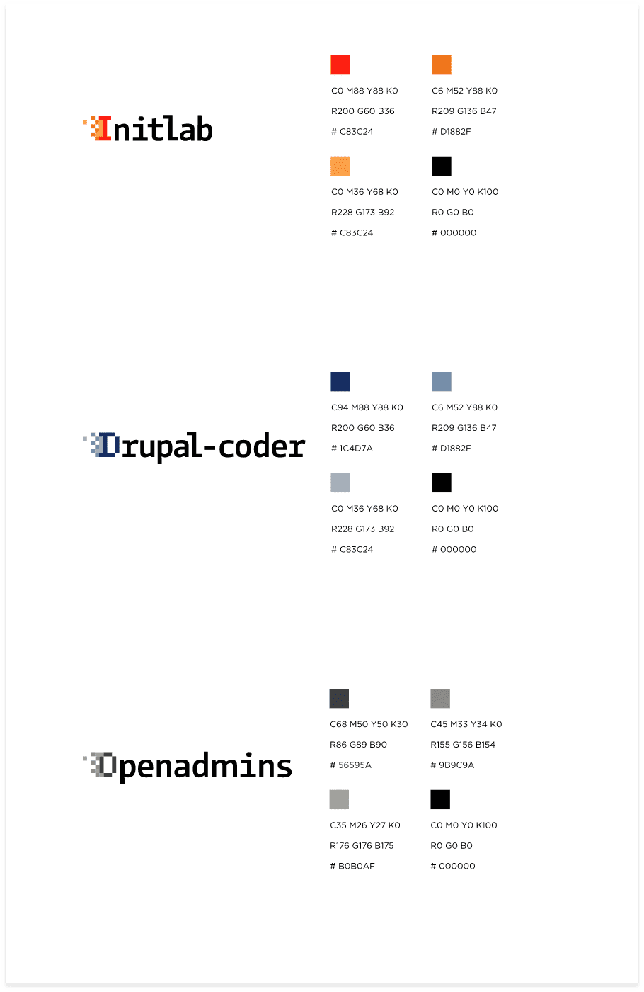
Working out the first letters of each direction and creating combinations with the main graphic element. Plus color differentiation for each type of service.

Result
This work is a good example of thoughtful rebranding, without destruction. A delicate change to an existing brand. The logo now looks much more professional. This small step not only accomplishes the task at hand, but also plays a huge role in the perception of the qualifications of the company itself.
